❕ 스타일시트 적용방법 세가지
<!DOCTYPE html>
<html lang="en">
<head>
    <meta charset="UTF-8">
    <title>css basic</title>
    <link href="css01.css" rel="stylesheet" type="text/css" />
    <style>
        h2 {background-color: blanchedalmond; color: coral;}

    </style>
</head>
<body>
   <h1>외부 스타일 시트</h1>
   <h2>내부 스타일 시트</h2>
   <h3 style="background-color: bisque">인라인 스타일 시트</h3>
</body>
</html>
css01.css 파일 안 코드 ⇃⇂
h1 {background-color: aliceblue}🔎 미리보기

💬 한줄을 전부 차지하는 요소로 한줄이 통으로 background-color가 바뀌었다.
외부에서 별도로 작성한 스타일시트 저장시 확장자명은 css로 해야 하고!!! 보여질 목록이 아니기 때문에 <head> 안에 써준다.
내부 스타일시트는 <head> 안에 <style> 태그 작성하여 안에 써주면 된다.
인라인 스타일시트는 태그 각각 안에 적용해주는 것인데 대량으로 한번에 수정하게 된다면 번거로울 수 있다.
❕ 선택자
선택자란? 스타일을 적용할때 그룹화하여 한번에 선택해야할 때도 있을것이고, 각각 개별적으로 선택해야할때도 있을것 이다. 이럴때 선택자를 이용하여 어느 요소에 적용할것인지 선택할 수 있다. 이 선택자의 종류와 방식은 매우 다양하다.
<!DOCTYPE html>
<html lang="en">
<head>
    <meta charset="UTF-8">
    <title>selector</title>
    <style>
        * { margin: 0;} <!--모든 요소에 스타일 적용-->
        h1, p {color: rebeccapurple} <!--쉼표로 선택자를 구분하여 동시에 선택 가능하다-->
        #container { <!--id를 선택할시에는 선택자 앞에#-->
            background-color: antiquewhite;
            width: 300px;
            height: 50px;
            margin: 0 auto;
        }
        .lorem { <!--class를 선택할시에는 선택자 앞에.-->
            background-color: beige;
        }
    </style>
</head>
<body>
   <h1>Hello HTML</h1>
   <h1>Hello CSS</h1>
   <div id="container">div 태그</div>
   <p>Lorem ipsum dolor sit amet, consectetur adipisicing elit. Temporibus quis ab voluptatum cumque magnam obcaecati quasi quia rem, sequi tempore itaque architecto, molestias libero quos aliquid ex cum illum doloremque!</p>
   <p class="lorem">Lorem ipsum dolor sit amet, consectetur adipisicing elit. Temporibus quis ab voluptatum cumque magnam obcaecati quasi quia rem, sequi tempore itaque architecto, molestias </p>
   <p>Lorem ipsum dolor sit amet, consectetur adipisicing elit. Temporibus quis ab voluptatum cumque magnam obcaecati quasi quia rem, sequi tempore itaque architecto, molestias libero quos </p>
   <p class="lorem">Lorem ipsum dolor sit amet, consectetur adipisicing elit. Temporibus quis ab voluptatum cumque magnam obcaecati quasi quia rem, sequi tempore itaque architecto, molestias libero !</p>
</body>
</html>
🔎 미리보기

💬 magin은 창과 글자 사이의 간격으로 기본설정이 약간 띄어져 있다. 0으로 주면 미리보기에서 보이는것 처럼 여백없이 딱 붙어서 출력 된다.
❕ 하위선택자 - 부모요소 아래의 하위요소를 선택
<!DOCTYPE html>
<html lang="en">
<head>
    <meta charset="UTF-8">
    <title> selsector</title>
    <style>
        div p {color:tomato;}
    </style>
</head>
<body>
   <h1>Hello css</h1>
   <p>Content1</p>
       <div>
           <p>Content2</p>
           <p>Content3</p>
       </div>
       <p>Content4</p>
</body>
</html>
🔎 미리보기

💬
Content2와 Content3은 <div> 요소 안에 있는 자식 요소 이다.
이렇게 두개만 스타일을 변경하고 싶다면 코드7줄처럼 [부모요소 (띄고) 자식요소] 작성후 스타일속성을 작성해주면 됨.
만약 그냥 p로 했을시 html안에 모든 <p>가 적용된 요소들이 전부 바뀜
❕ 자식선택자 - 부모요소안에 있는 원하는 자식요소를 선택
<!DOCTYPE html>
<html lang="en">
<head>
    <meta charset="UTF-8">
    <title>seletor</title>
    <style>
        #container > ul { border: 1px solid red;}
    </style>
</head>
<body>
   <h1>Hello css</h1>
   <div id="container">
       <h1>Hello css in container</h1>
       <!--ul>li*2-->
       <ul>
           <li>list1
               <ul>
                   <li>list1-1</li>
                   <li>list1-2</li>
               </ul>
           </li>
           <li>list2
               <ul>
                   <li>list2-1</li>
                   <li>list2-2</li>
                   <li>list2-3</li>
                   <li>list2-4</li>
               </ul>
           </li>
       </ul>
   </div>

</body>
</html>
🔎 미리보기

💬 id값이 container의 자식요소 ul에만 스타일 적용
❕ 형제선택자 (등위선택자) - 동등한 위치의 태그를 선택
<!DOCTYPE html>
<html lang="en">
<head>
    <meta charset="UTF-8">
    <title>selector</title>
    <style>
        h3 ~ ul { color:blue; font-weight:bold;}
        h3 + ul { border:2px solid red;}
    </style>
</head>
<body>
    <ul>
        <li>list1-1</li>
        <li>list1-2</li>
    </ul>
    <h3>Hello CSS</h3>
    <ul>
        <li>list2-1</li>
        <li>list2-2</li>
    </ul>
    <ul>
        <li>list3-1</li>
        <li>list3-2</li>
        <li>list3-3</li>
    </ul>
</body>
</html>
🔎 미리보기

💬 ~은 동등한 위치의 형제요소 모두에 적용하고, +은 동등한 위치의 형제요소중 제일 인접한 요소에만 스타일을 적용한다.
속성선택자 - 속성과 관련된 태그를 선택하여 적용
<!DOCTYPE html>
<html lang="en">
<head>
    <meta charset="UTF-8">
    <title>selector</title>
    <style>
        ul {list-style: none;}
        li {width:100px; display:inline; margin:10px;}
        a {text-decoration: none; font-size: 25px; color:black; padding: ;}
/*        a[href] {background-color: aquamarine}*/
/*        a[target="_blank"] {background-color: aquamarine}*/
        a[class^="j"]{background-color: aquamarine} /*특정값으로 시작하는 속성 찾아 적용*/
        a[class*="sp"]{background-color: coral} /*특정값을 포함하는 속성 찾아 적용*

    </style>
</head>
<body>
   <ul>
       <li><a>Main munu : </a></li>
       <li><a href="#" class="java">menu1</a></li>
       <li><a href="#" class="jsp">menu2</a></li>
       <li><a href="#" class="spring">menu3</a></li>
   </ul>

</body>
</html>
🔎 미리보기

💬 선택자[속성,속성값]
가상클래스 - 사용자 동작에 반응하는 스타일 적용
<!DOCTYPE html>
<html lang="en">
<head>
    <meta charset="UTF-8">
    <title>selector</title>
    <style>
    ul {list-style: none;}
        li {width:100px; display:inline; margin:10px;}
        a {text-decoration: none; font-size: 25px; padding: ;}
        a:link {color:black;}
        a:visited {color:red;}
        a:hover {background-color: yellow;}
        a:active {color: blue;}
        a:focus {background-color: darkgray;}
    </style>
</head>
<body>
   <ul>
       <li><a>Web Site</a></li>
       <li><a href="http://naver.com">naver</a></li>
       <li><a href="http://google.com">google</a></li>
       <li><a href="http://daum.net">daum</a></li>
   </ul>

</body>
</html>
🔎 미리보기


💬 active와 focus는 거의 비슷하다
구조 가상 클래스 - 특정 위치에 있는 요소 찾아 스타일 적용
<!DOCTYPE html>
<html lang="en">
<head>
    <meta charset="UTF-8">
    <title>selector</title>
    <style>
        table {background:#fdd; border: 1px solid}
        tr:nth-child(2n) {background: yellowgreen;}
    </style>
</head>
<body>
   <h1>Marvel</h1>
    <table>
        <tr>
            <td>아이언맨</td>
        </tr>
        <tr>
            <td>캡틴아메리카</td>
        </tr>
        <tr>
            <td>토르</td>
        </tr>
        <tr>
            <td>헐크</td>
        </tr>
        <tr>
            <td>데드풀</td>
        </tr>
    </table>
</body>
</html>
🔎 미리보기
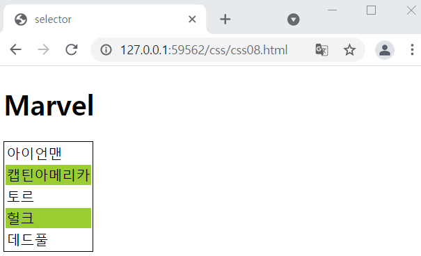
💬
nth-child 안쪽에 수식을 적어서 규칙을 결정한다.
포지셔닝 float 속성 - 위치 설정
<!DOCTYPE html>
<html lang="en">
<head>
    <meta charset="UTF-8">
    <title>Document</title>
    <style>
        .cont{
            width: 900px;
            margin: auto;
        }
        .box1 {
            background-color: skyblue;
            width: 200px;
            height: 150px;
            margin: 10px;
            padding: 30px;
            float: left;
        }
        .box2 {
            background-color: darkseagreen;
            width: 200px;
            height: 150px;
            margin: 10px;
            padding: 30px;
            float :left;
        }
        .box3 {
            background-color: orange;
            width: 600px;
            height: 150px;
            margin: 10px;
            padding: 30px;
            float :right;
        }
        .box4 {
            background-color: darkgrey;
            width: 200px;
            height: 150px;
            margin: 10px;
            padding: 30px;
/*            float :right;* */
            clear: both /*float 영향 안받고 싶을때 */
        }

    </style>
</head>
<body>
  <div class="cont">
       <div class="box1">box1</div>
       <div class="box2">box2</div>
       <div class="box3">box3</div>
       <div class="box4">box4</div>
    </div>
</body>
</html>
🔎 미리보기

💬 margin: auto 하면 중앙정렬
시멘틱 태그 + 가변레이아웃
<!DOCTYPE html>
<html lang="en">
<head>
    <meta charset="UTF-8">
    <title>Document</title>
    <style>
        #wrapper {
            width: 80%;
            margin: 0 auto;
        }
        header {
            width: 100%;
            height: 120px;
            background-color: aliceblue;
            border-bottom: 1px solid navy;
        }
        .header-text{
            font-size: 40px;
            color: navy;
            text-align: center;
            line-height: 120px;
        }
        section {
            float: left;
            width: 64%;
            height: 400px;
            padding: 15px;
            background-color: azure;

        }
        aside{
            float: right;
            width :20%;
            height: 400px;
            padding: 15px;
            background-color: aqua;
        }
        footer{
            clear: both;
            height: 120px;
            color: white;
            background-color: hotpink;
        }
        }
    </style>
</head>
<body>
    <div id="wrapper">
        <header>
            <h1 class="header-text">시멘틱</h1>
        </header>
        <section>
            <h4>본문</h4>
        </section>
        <aside>
            <h4>사이드바</h4>
        </aside>
        <footer>
            <h4>푸터</h4>
        </footer>


    </div>
</body>
</html>
🔎 미리보기


💬
시멘틱 태그란 헤더, 본문, 사이드바, 푸터 등으로 역할에 맞게 분류하여 구성한것으로 기본 구조? 템플릿?이라 생각하면 되고 설정은 알아서 다해야함. 가변레이아웃은 반응형웹 같은거 생각하면 되는데 사이즈가 픽스된게 아니라 화면이 커지거나 작아짐에 따라 사이즈가 조정됨
미디어 쿼리
<!DOCTYPE html>
<html lang="en">
<head>
    <meta charset="UTF-8">
    <title>Document</title>
    <meta name="viewport" content="width=device-width, initial-scale=1" />
    <style>
        body {
            background: url(imgs/bg0.jpg) no-repeat fixed;
            background-size : cover;
        }
        @media screen and (max-width:1024px){
            body{
                background: url(imgs/bg1.jpg) no-repeat fixed;
                background-size : cover;
            }
        }
        @media screen and (max-width:768px){
            body{
                background: url(imgs/bg2.jpg) no-repeat fixed;
                background-size : cover;
            }
        }
        @media screen and (max-width:320){
            body{
                background: url(imgs/bg3.jpg) no-repeat fixed;
                background-size : cover;
            }
        }

    </style>
</head>
</html>
🔎 미리보기
없숨다,.,.캡처하기 애매쓰하여
💬 접속하는장치에 따라 특정스타일을 적용하는것 이다.
위의 실습예제는 화면 사이즈가 달라짐에 따라 백그라운드 이미지가 달라집니다.
근데 이미지가 세개까지만 바뀌고 마지막은 안나옴...! 쌤은 해상도가 좋아져서 그런건가 싶다고 하셨다
'basic > HTML, CSS' 카테고리의 다른 글
| HTML 기본중 기본 스크립트 파일 추가 태그 (0) | 2022.02.16 |
|---|---|
| day 22 실습(2) - 회원가입 from 만들기 (0) | 2021.05.25 |
| day 22 - CSS (0) | 2021.05.25 |
| day 21 실습 (2) - HTML (이력서 양식 만들기) (0) | 2021.05.24 |
| day 21 실습 - HTML 태그 (0) | 2021.05.24 |